Instagram Grid Changed: Here's What You Need to Know
Instagram introduced a major change to its profile grid last January. For years, the Instagram grid maintained a standard 1:1 aspect ratio, ensuring that every post appeared as a square preview on your profile. However, with this recent update, Instagram shifted to a 3:4 vertical aspect ratio, significantly altering the way your content appears on your profile.
What Does This Change Mean for You?
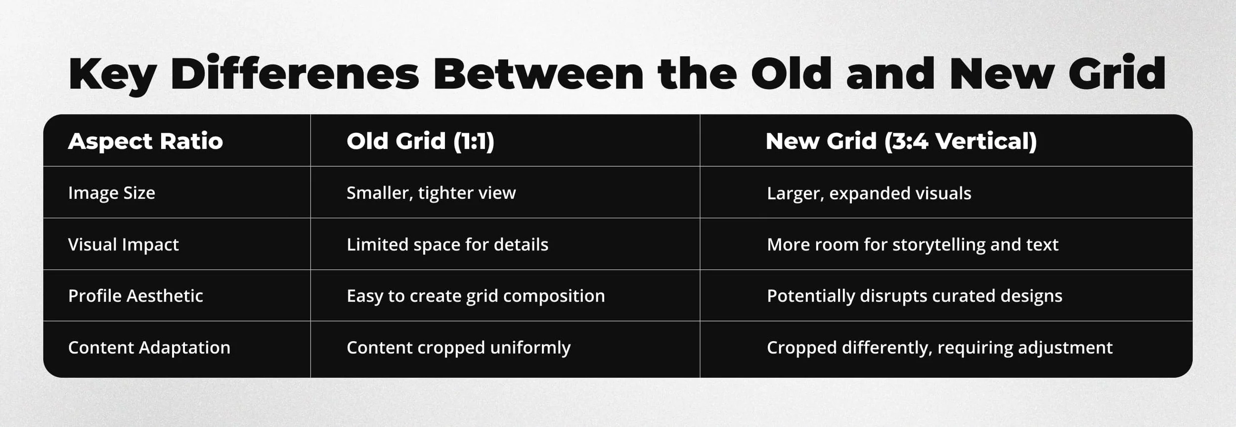
While this new 3:4 aspect ratio offers some clear benefits, it also introduces potential challenges for creators, brands, and businesses alike. Here's a breakdown of what has changed and how it may affect your content:
Table comparison of Old VS New Instagram Grid aspects.
Visual comparison of Old VS New Grid
Potential Challenges with the New Grid
Curated Grids May Break Many users meticulously designed Instagram grids with alternating colors, puzzle-style layouts, or patterns that rely on the old 1:1 format. The new 3:4 grid may cut off essential parts of these designs, potentially disrupting visual harmony.
Cover Thumbnails May Appear Inconsistent If you rely heavily on cover designs for Reels or carousel posts, these may no longer fit as intended, making profile aesthetics inconsistent.
Cropping Issues With a taller frame, content designed to sit comfortably in a square may now appear too tight or incomplete.
The Upside: Why the New Grid Can Improve Your Content
Despite the challenges, the new 3:4 aspect ratio opens new opportunities for storytelling and engagement.
More Space for Visual Impact The expanded height allows for larger visuals and easier-to-read text, ideal for tutorials, infographics, or product showcases.
Better Showcase of Details Creators can now highlight intricate designs, rich textures, and key details that may have previously been lost in tighter framing.
Improved Readability for Text-Based Content With more vertical room, you can feature clearer headlines, captions, and graphics without overwhelming your audience.
How to Adapt Your Content for the New Grid
To make this transition easier for creators, we’ve developed a free Safe Zone Template — a simple yet powerful tool designed to help you place text, visuals, and key elements strategically for optimal visibility in the updated grid format.
Our Free Safe Zone Template is Simple to Use
Our free Safe Zone Template is available in PNG format. It's very easy to use. Just download it, place it on top of your photo, thumbnail, or whatever you want to use. Use it as an overlay, and you'll soon see what fits in and what does not. From there, you can adjust text and other elements as needed.
Free Instagram Grid Safe Zone Template
Why It Matters for Brands and Creators
Whether you’re a business showcasing products, a content creator building a curated aesthetic, or a visual storyteller looking to captivate your audience, adapting to the 3:4 format is crucial to maintaining your profile’s impact. Our free Safe Zone Template is your best ally in navigating this shift.
Get Our Free Safe Zone Template Now
We’re offering our free Safe Zone Template for free on Gumroad to help creators and brands like you stay ahead of the curve. Don’t let the Instagram grid update catch you off guard. Download the template today and ensure your content looks its best.
Download Our Free Safe Zone Template on Gumroad
Final Tip
If your Instagram profile has been designed with a curated visual style, consider reviewing your past posts and identifying key visuals that may require re-editing or reposting. Embracing this change proactively will ensure your content continues to stand out in the new Instagram landscape.


